UX
COURSE SITE
Project role: UX Design Intern.
Project time: This project was completed over 3 months as part of a UX internship with Yael Levey (formally of the BBC and now Facebook).
Please note: Some sections of these designs have been removed for legal reasons.
The Challenge
There are a lot of sites that will teach you the principals of UX, but not the practical soft skills like hosting workshops, leading the design work on projects and leading meetings.
Therefore my task was to research and wireframe a design for a homepage and content page for a 'soft skills' UX site. Keeping in mind that the site would be built using basic HTML, CSS and JS on Wordpress.
The Outcome
• Yael loved the designs and took both my research findings and wireframes forward to help with the creation of her UX site.
• She taught me the importance of research no matter how small the feedback pool may be and how something as simple as a survey can help to validate ideas.
• Thank you to Yael for all of her help and wisdom!
The Research
• Google survey. Asking people who have an interest in UX design what they want from a UX based course.
• Looking at competitor’s sites (Career Foundry, Nielson Norman, Skill Share, Udemy etc) and UX strategies.
• Looking at competitor’s social media accounts to see how they go about building their products, customer bases and what USPs they use in order to draw customers in.
Google Survey Results
Myself and Yael invited people via our social media accounts to fill out a Google survey in order to gather some data on UX courses.

Research Findings
Landing page/Homepage
Should be simple and to the point with no fluff e.g.‘what we offer and it’s written by someone who knows what they are on about. This is what you get for X price.
’Short and to the point headlines encourage people, in particular Udemy’s search bar gets users to the content that they want, quickly.
Content
• Details like views, comments, dates published etc area must. We know these are valuable details thanks to YouTube, Facebook, Medium and other site’s layouts.
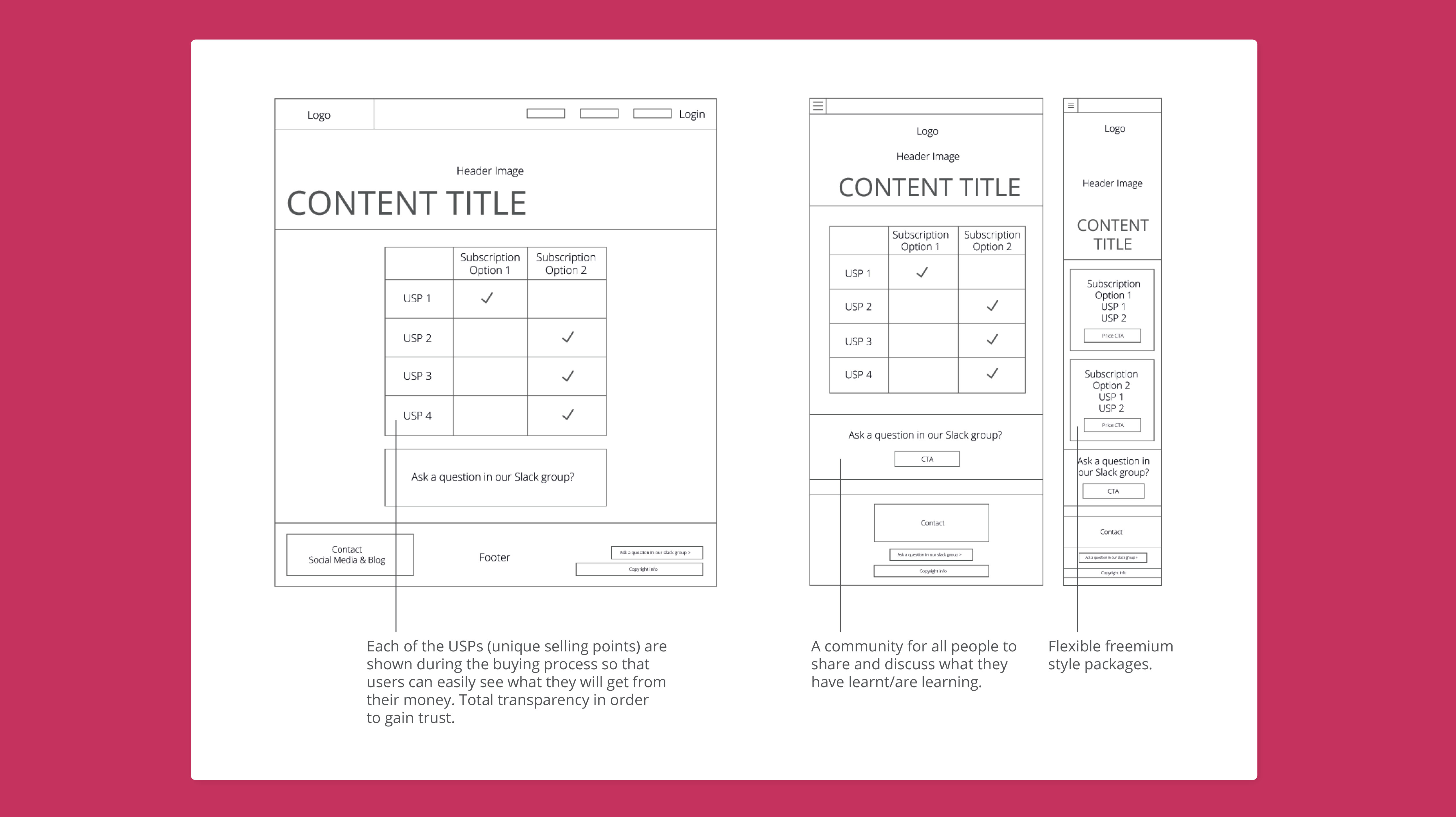
• Some competitors are extremely vague about the course content. However I felt that people would be more inclined to sign up if they knew more about what they were paying for.
• ’Time to read’ would be a good way to show people whether they have time to read an article.
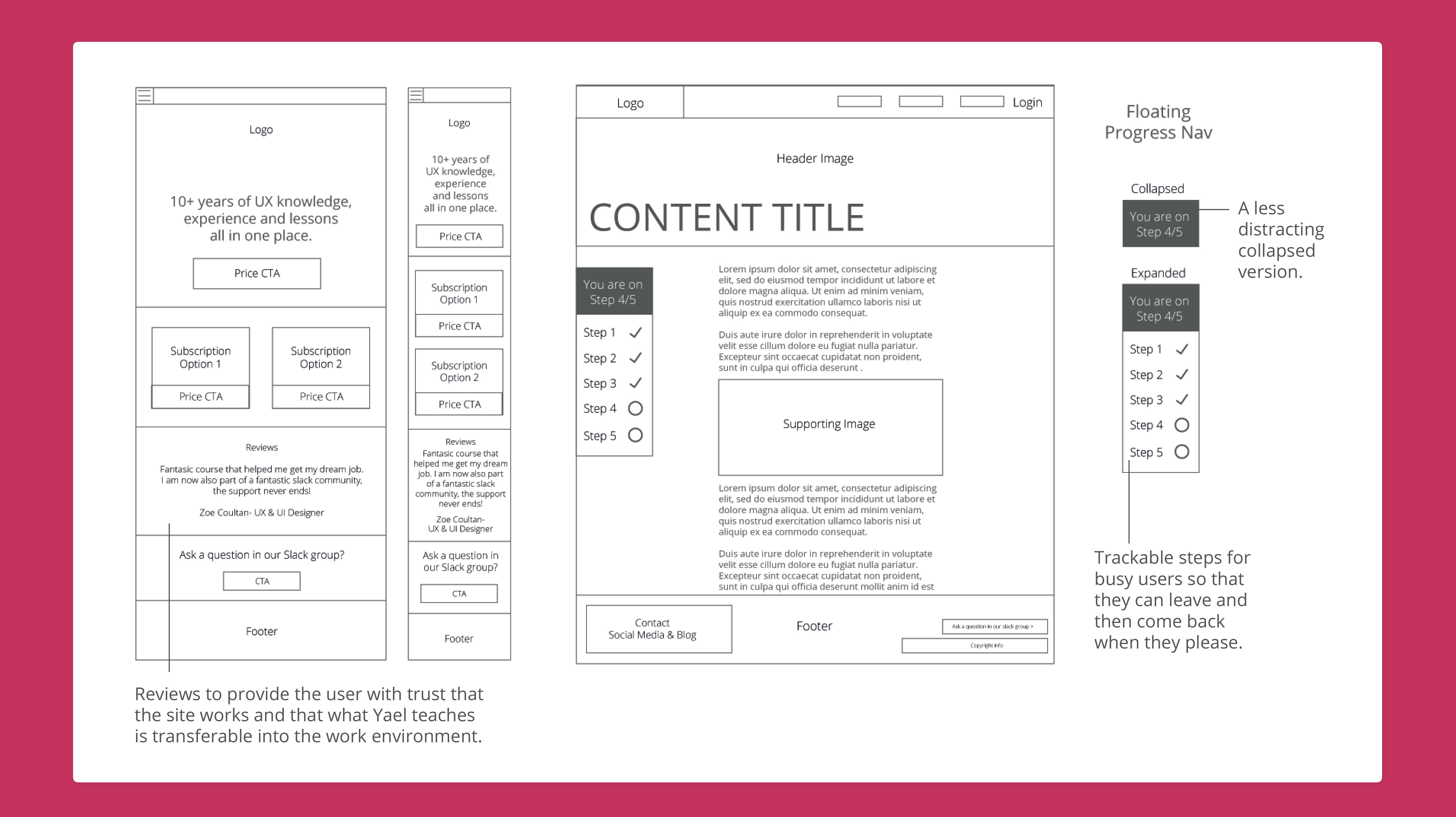
• There could also be a bookmarking system or progress bar etc so people can see where they are up to within the course.
• The survey and other course‘s content have shown me how important it is to explain who the course tutor is and what experience they have had in order to gain trust from the user.
Prices
Prices should be obvious and not hide anything in order to gain the user’s trust. The survey showed us that the course should be relatively cheap yet provide support and flexibility.
Other
There seems to be a surprising amount of these sites that don’t practice basic site accessibility, however this is a fundamental part of UX.
Key Takeaways
• Use Yael’s experience as a unique selling point.
• To promote the Slack community, ensure people know they can get to know other UX’ers and both network and ask questions.
• Show ‘time to read’ at the top of each article so that the user can work the course around their own time.
• Not too serious, yet informative and professional.
• Advertise bonus content and give ‘sneak peaks’ of what is in it.
• Show what practical skills you’ll be teaching during the course, allow the user to see what they are getting for their money.
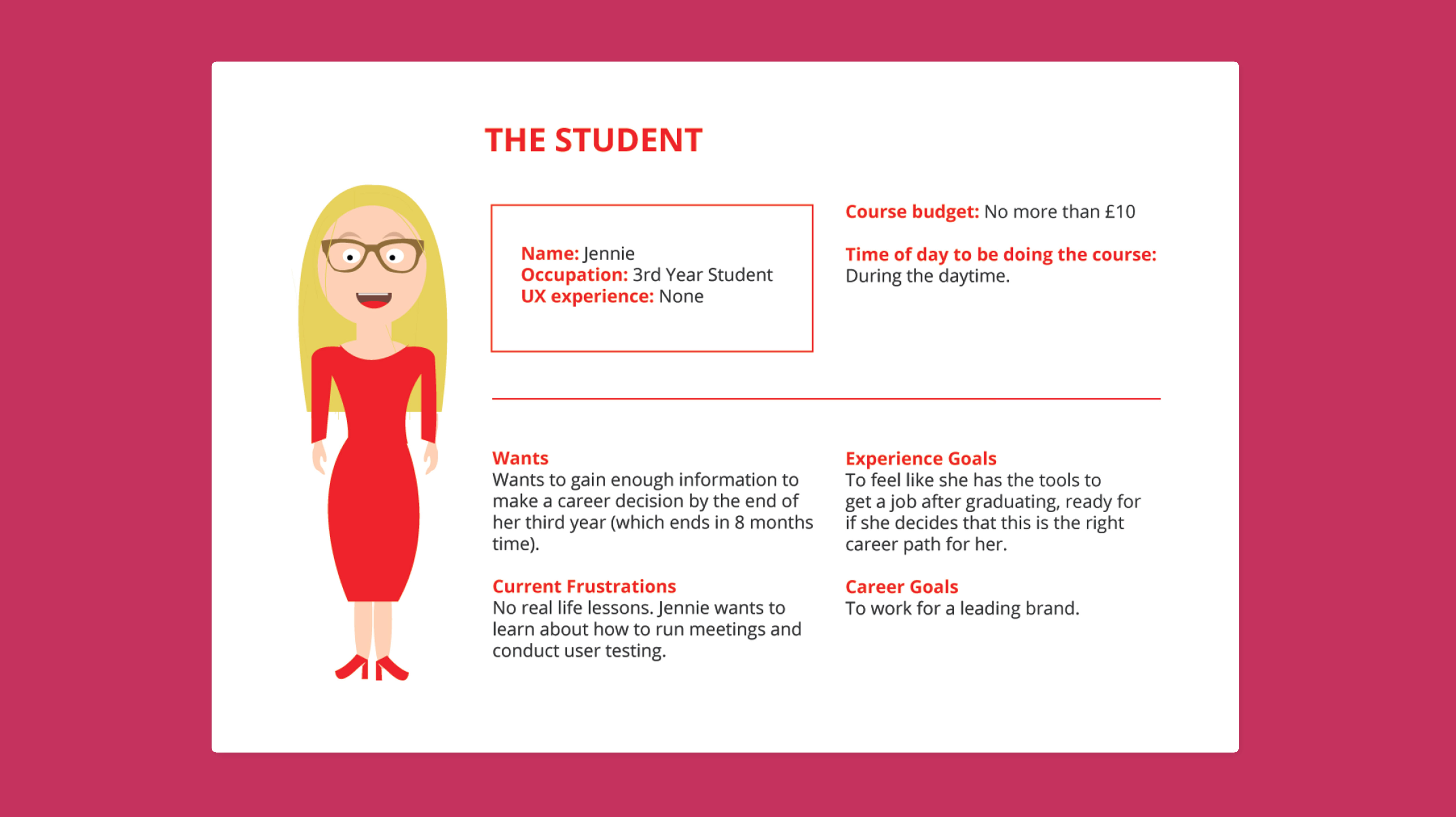
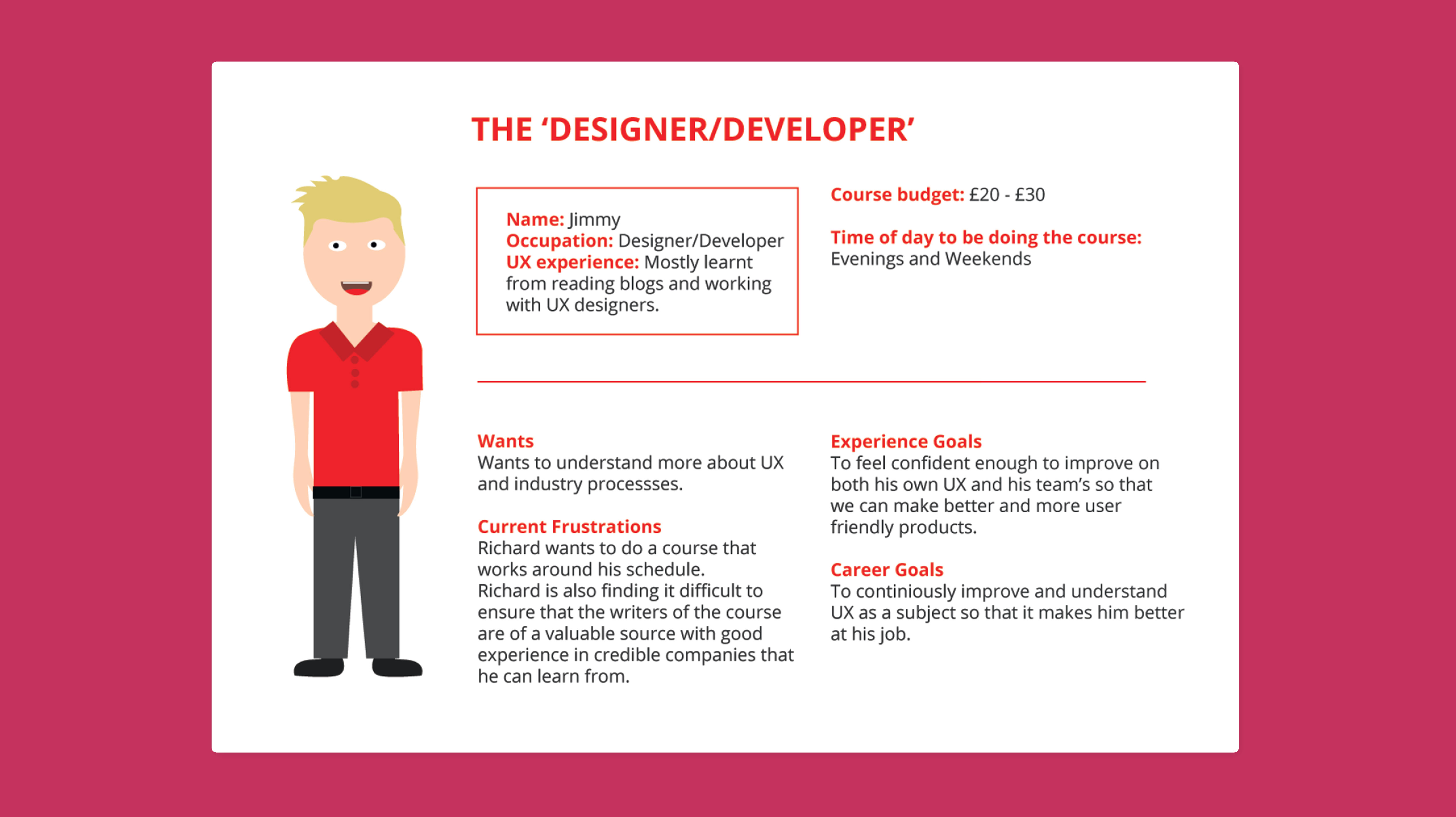
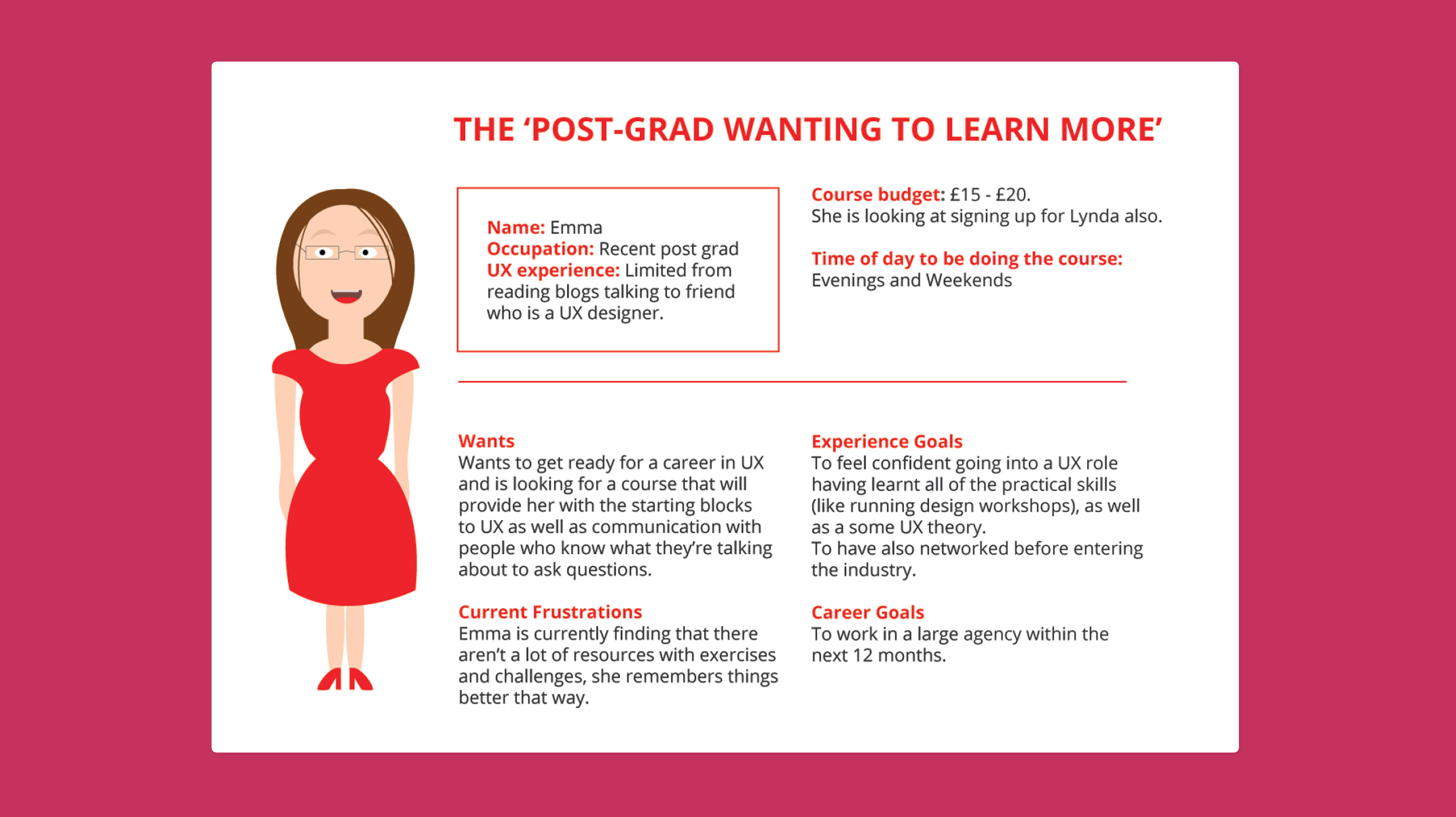
Personas
I then drew personas up to give myself a clear understanding of the variety of users that would be interacting with the site and the types of needs my users had which I discovered during my research.
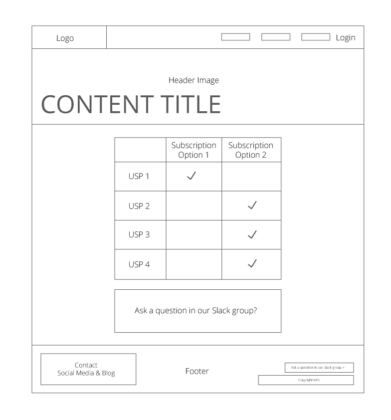
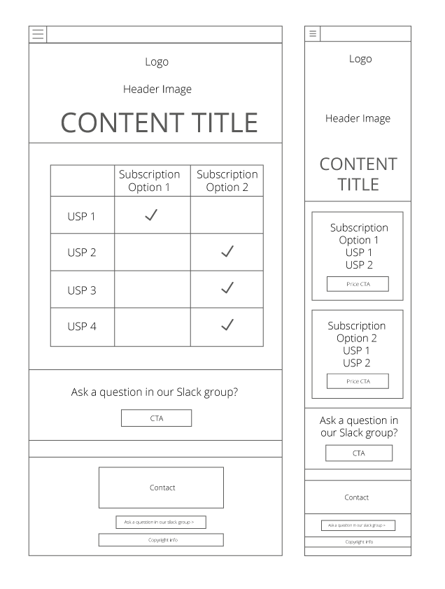
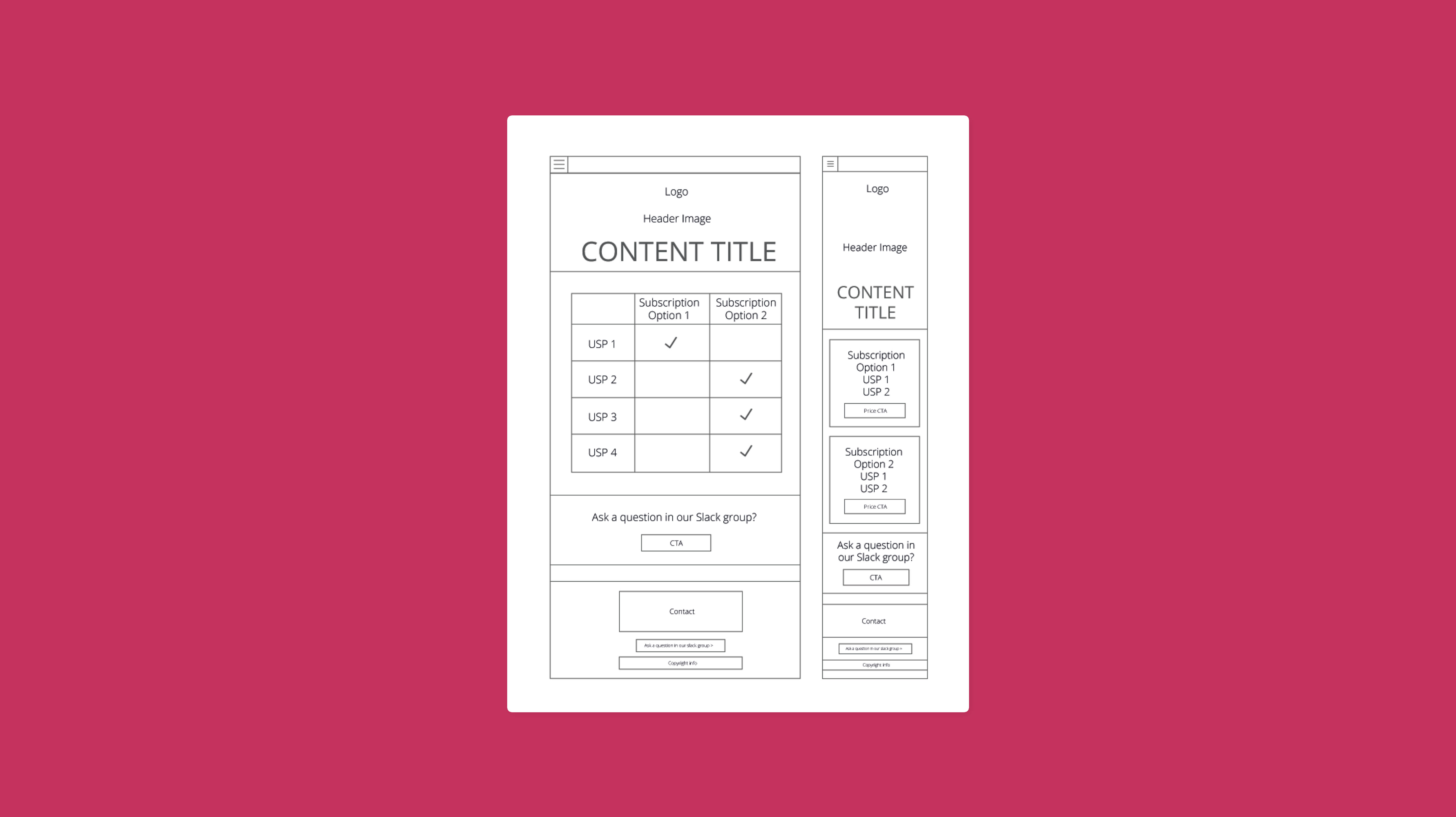
Wireframes
Below are the suggested wireframes that were created as a result of my research findings, ensuring to include all key takeaways.