Payroll producT
Project role: UX/UI Design Lead
Project time: This user flows are part of an overall on-going project.
Please note: Some sections of these designs have been removed for legal reasons.
The Challenge
The challenge is to define and develop the UX and UI of our payroll system as part as an overall project where the product is being built as a web app, all while navigating the technical limitations of the current payroll product that we will be using to help build the web app. Here are some examples of the ways in which I have worked as part of this ongoing project.
The Outcome
• So far, sales of the product have increased by 400%+ (this continues to be monitored).
• New functionality has been well used with minimal negative feedback, any feedback with a large enough sample size (at least 5+ users) have been addressed and included in future sprints as part of the roadmap.
• User feedback shows 'delight' at a faster and easier to use process.
• Users were able to use the new functionality with minimal impact and reliance on support.
The Research
• Looking at the data available in Pendo in order to identify existing pain points and similar successful patterns.
• Taking feedback from the existing product and using that to drive the improvements into the new processes on the platform.
• Discovering what our users don't like about existing products and strategising with the product manager on how to fix them.
• Researching the best and legal practises within the payroll industry that affect the new process.
• As the product manager had worked in payroll for many years, I often picked her brains about various work flows and industry best practises.
The Process
• Gather project requirements and goals from the PM and support these with any user findings we have (user feedback, Pendo data etc.)
• Get demos from the developers who have worked on the legacy system to understand technical limitations and and successful/unsuccessful existing workflows.
• Incorporate payroll industry best practices and legal requirements.
• Develop and refine a user flow.
• Create a low fidelity prototype/wireframes and identify which mechanisms will work best as part of the flow in order to create the fastest and easiest to use version of the process.
• Work with the developers to iron out any technical limitations and identify any opportunities and ensure a seamless build.
Building the Design System
• During my time at this job, I have collaborated on building, designing and maintaining the design system.
• Researching and implementing good organisation.
• Be flexible, easy to update and to be able to be used by anyone in the team as well as part of developer handovers.
• Available in both Sketch and Figma.
• Available in both light and dark themes by using a theme switcher plugin.
• Working with developers to ensure that naming conventions and components are all consistent.
Legacy System Demos
Understanding technical limitations and the current successful/unsuccessful existing workflows.
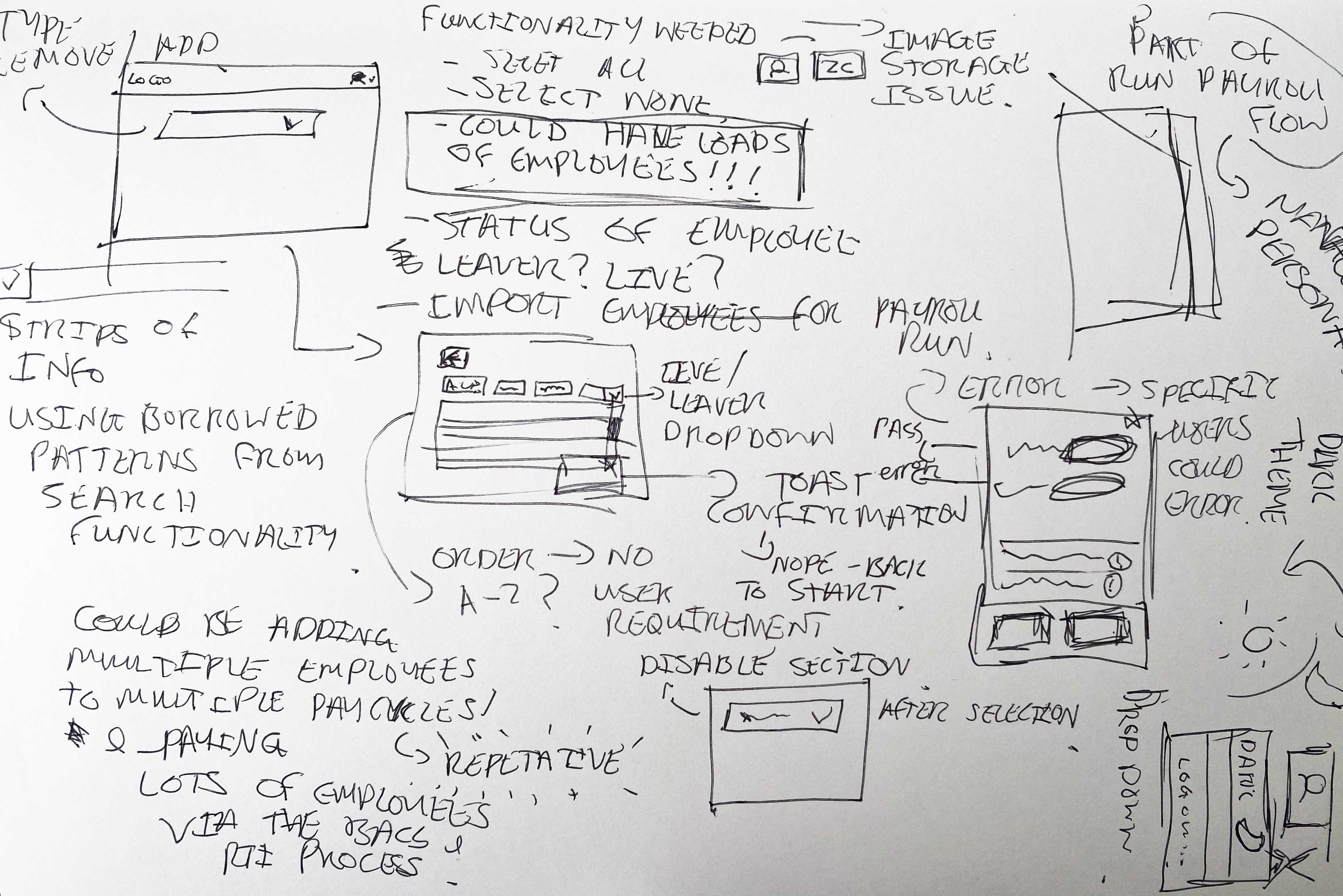
Initial Sketches
Empathy Mapping
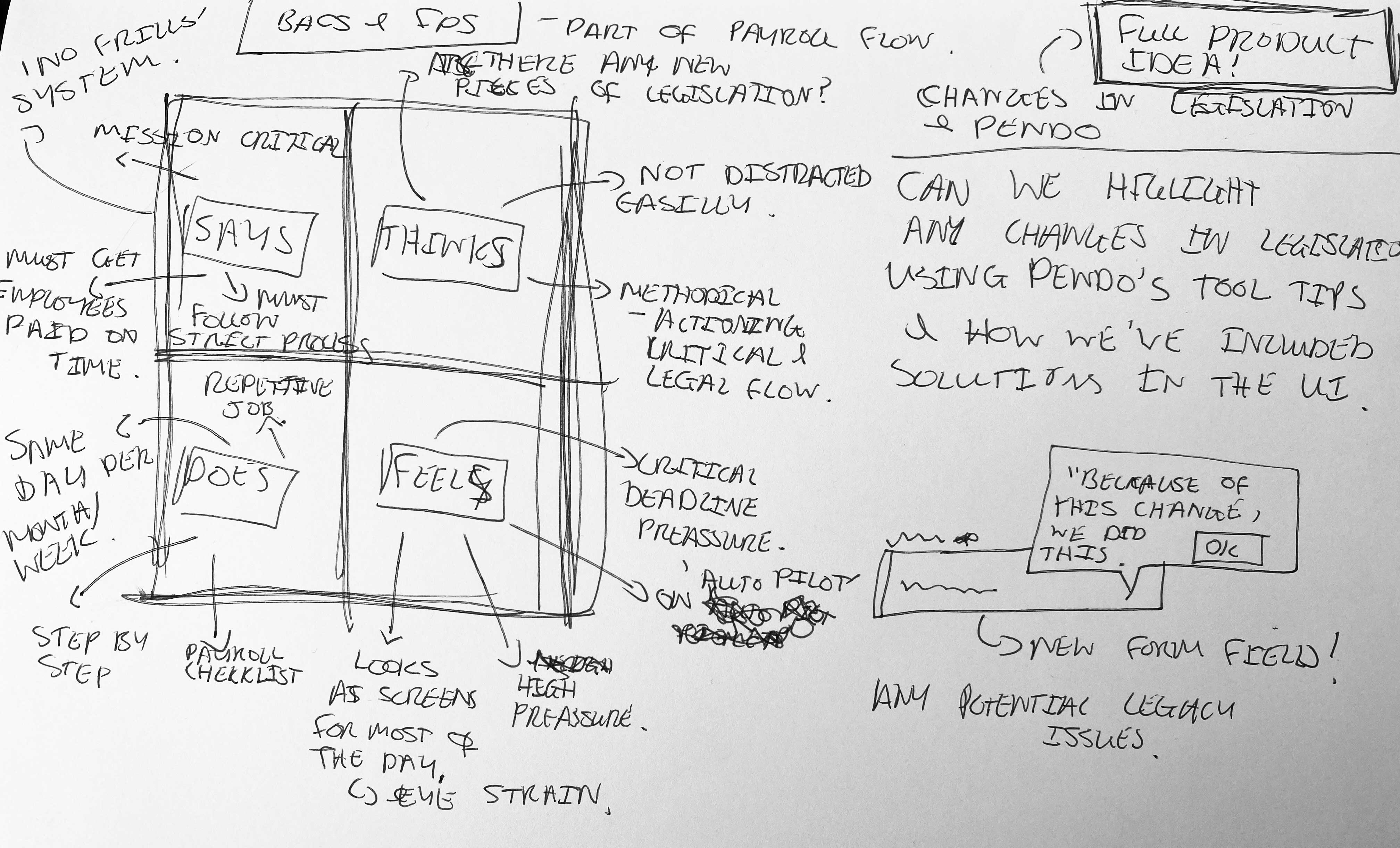
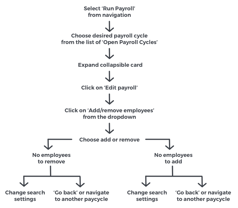
User Journey - Happy Path Example
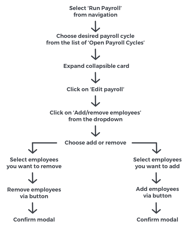
User Journey - Sad Path Example
Lofi Prototype/Wireframes
When designing new functionality, I use a combination of low-fi and high-fi elements in my prototypes to show new elements in the context of both pre existing and validated parts of the design.
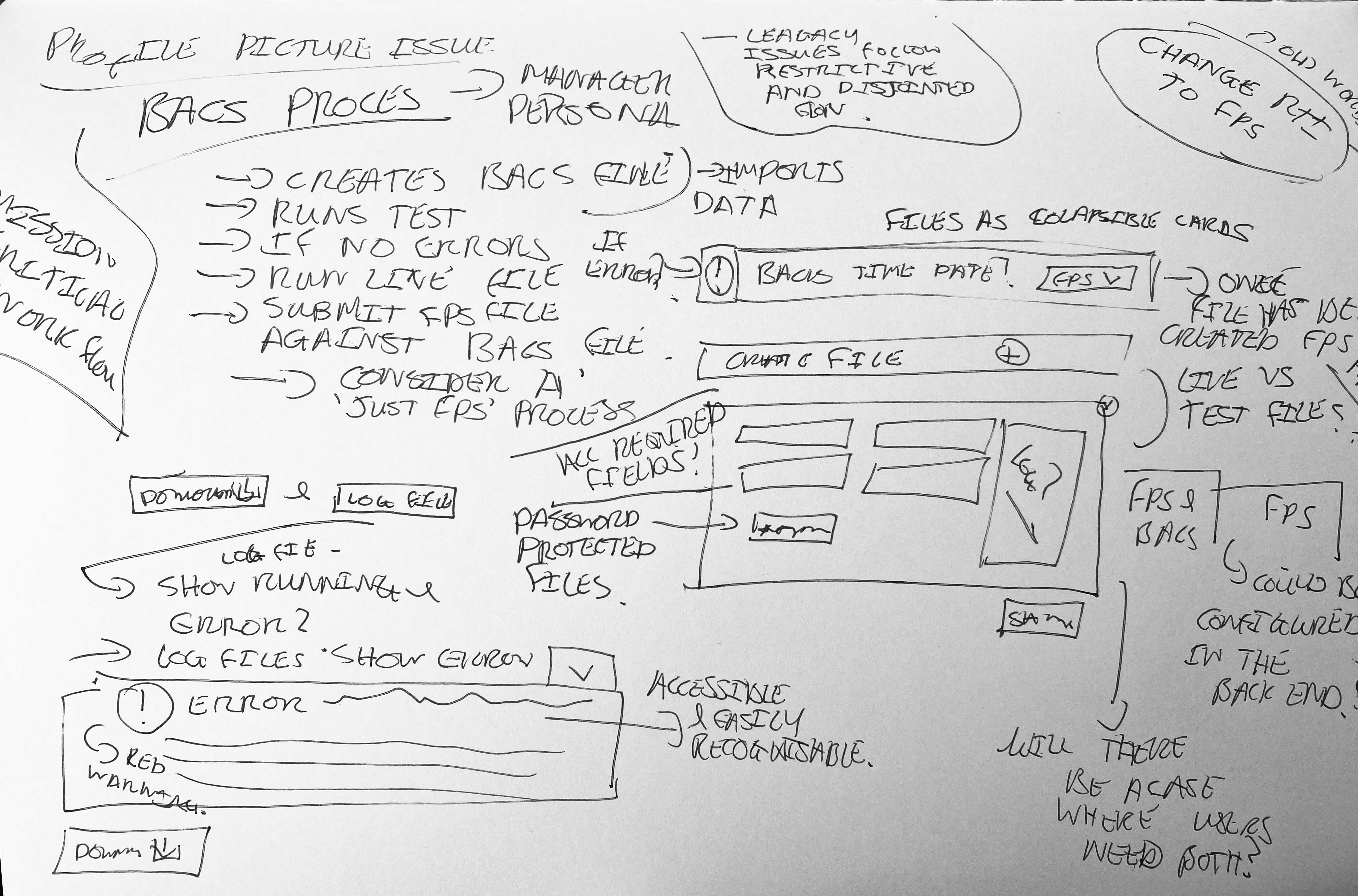
3 Amigos - Opportunities Found
After the initial design in the form of a low fidelity prototype had been signed off by the product manager, a meeting between myself, a front end developer and a backend developer took place to see if there were any technical issues that may occur as a result of my designs. Designs were presented using an InVision prototype which the developers also had access to.
It was identified that the code could give us the data that could show which users gave an error and why, while adding the users to the payroll.
By using data, I identified that this information would be useful to the user and I then turned the process into a high fidelity prototype and designed a new modal to give the user the information we now know is available.

Technical constraints
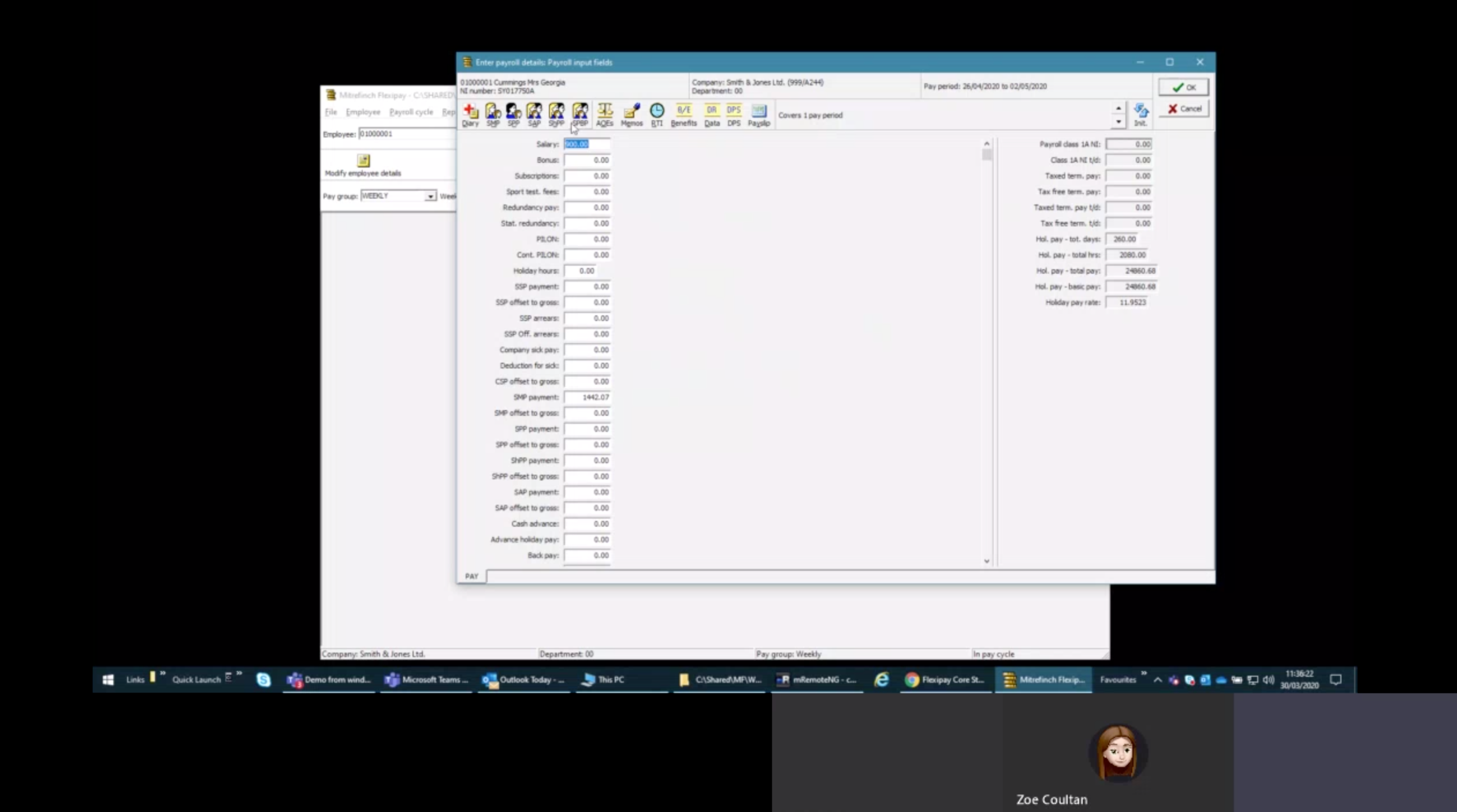
It is currently not possible at this time to store the employees profile pictures and so therefore I decided to default all user profiles to have a random colour containing the employee's initials, this follows a common user pattern which can be found in some popular tech products.
User Testing, Feedback and Parallel Runs
In order for users to onboard to our product, we have them use it alongside their existing provider in order to ensure there are no gaps within a tax year, no issues with the customer's employee pay and that there are no gaps in functionality we may need to include as part of the future product roadmap.
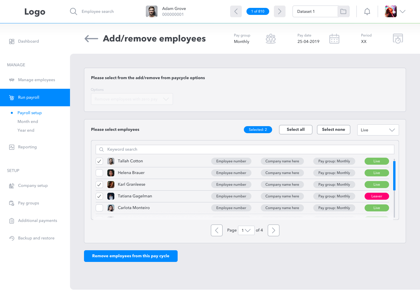
After initial designs were shown to users, there were comments on the backgrounds of the user profiles.
Multiple users were commenting on how they thought the random colour meant something.
User quotes are as follows:
• "Does this colour means that they are part of a pay group?"
• "This colour means that they were part of an existing payroll cycle doesn't it?"
• "I thought an employee was a leaver because of the red colour?"
This helped me realise that in the context of payroll that these colours were causing more confusion than they do in a more generic text setting and that a default colour would make much more sense.
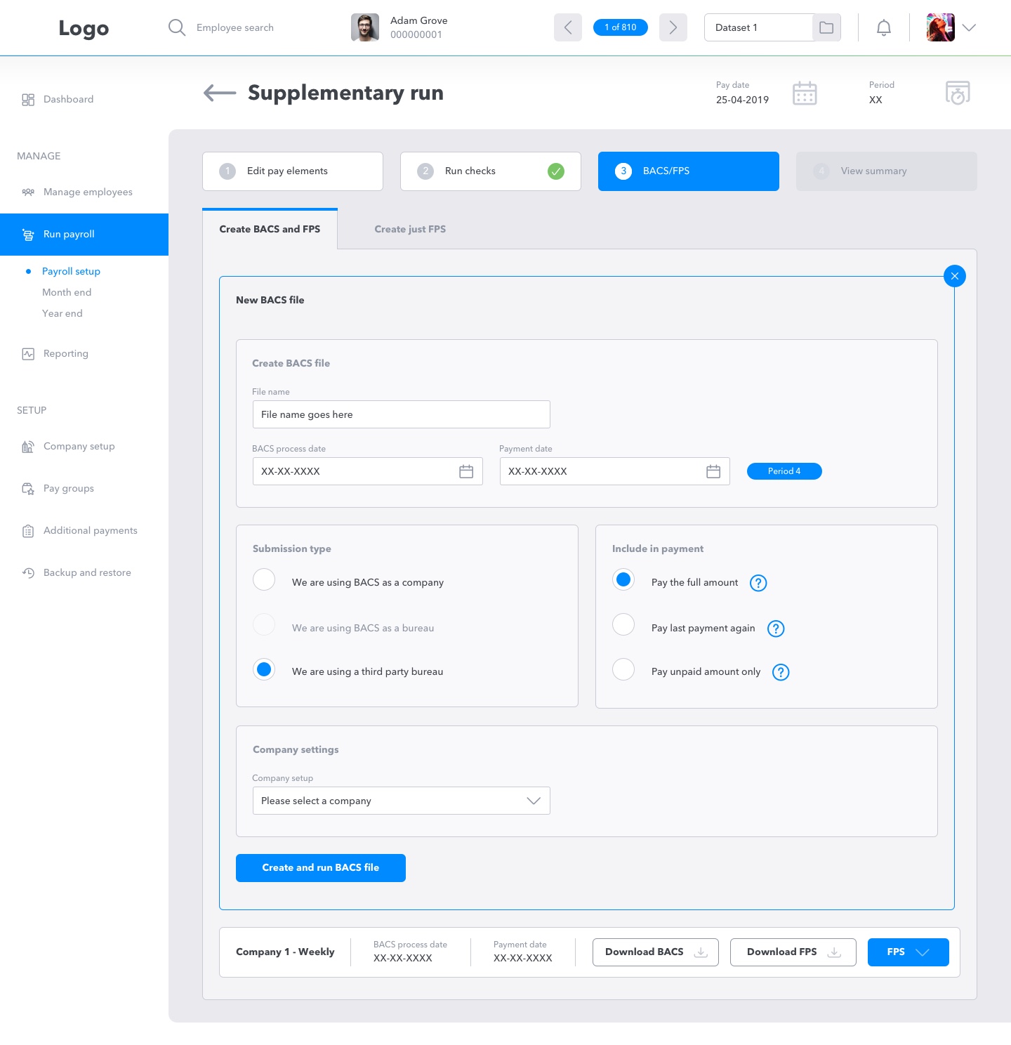
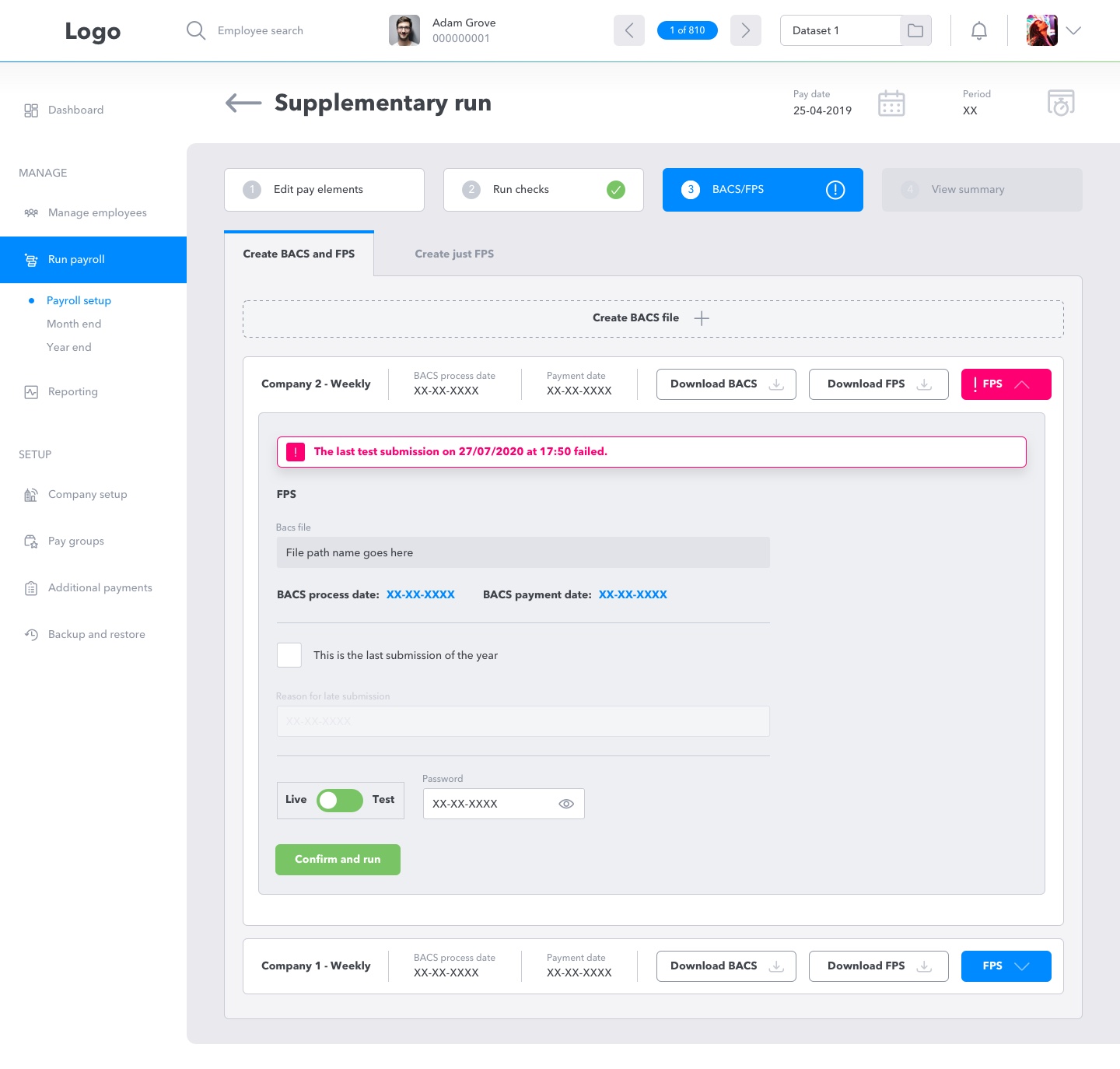
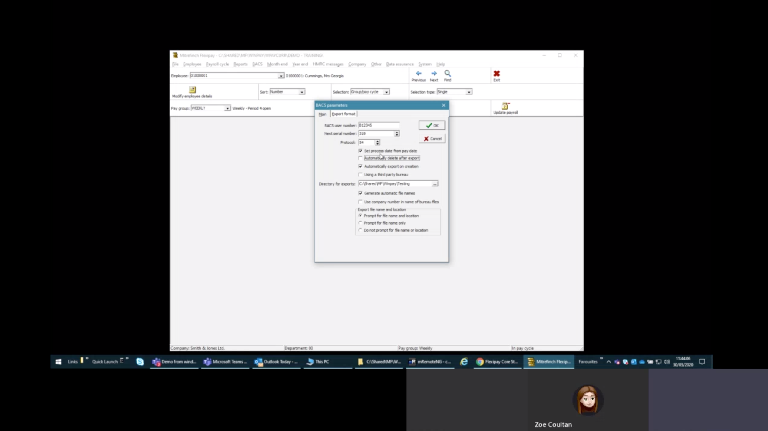
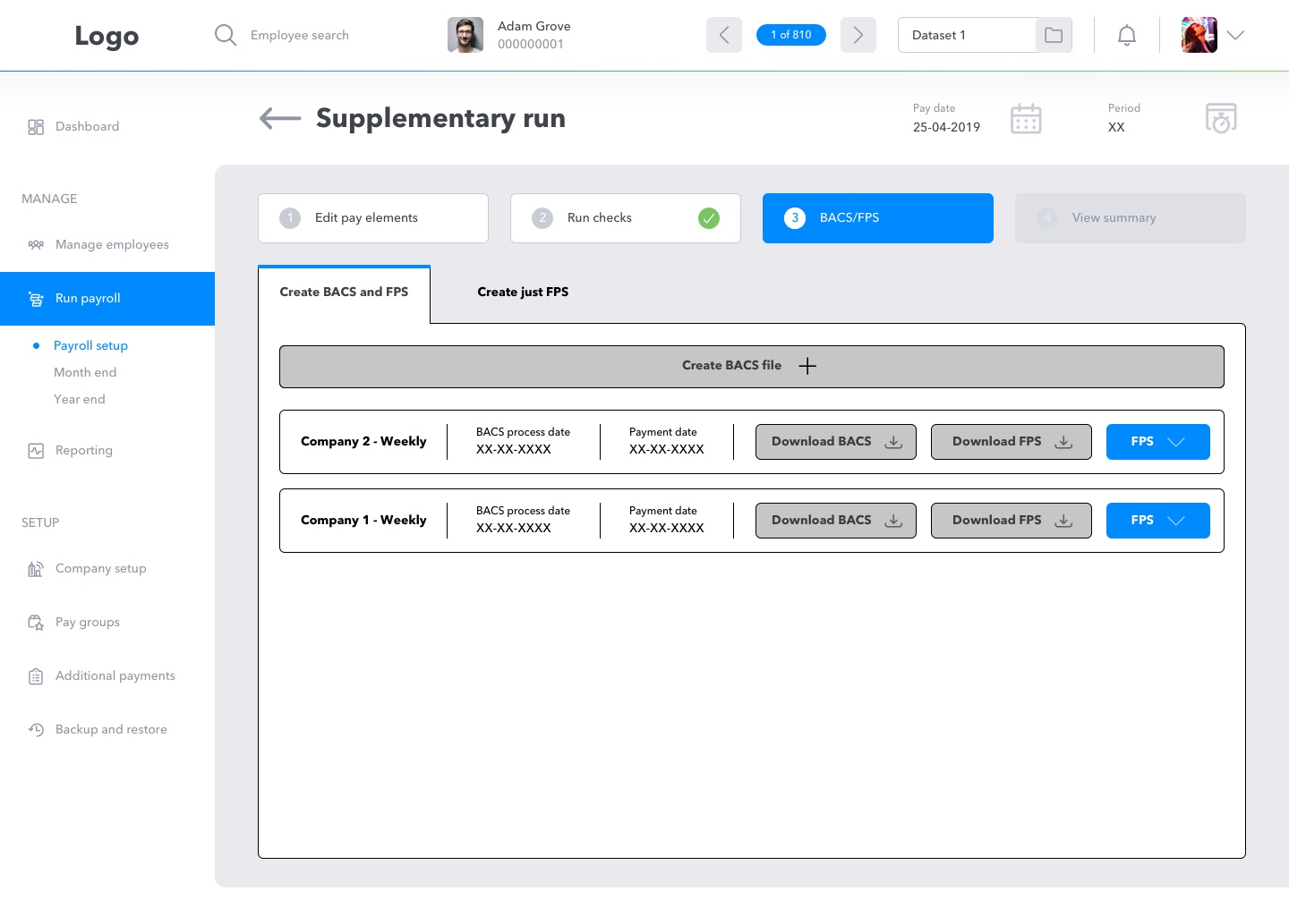
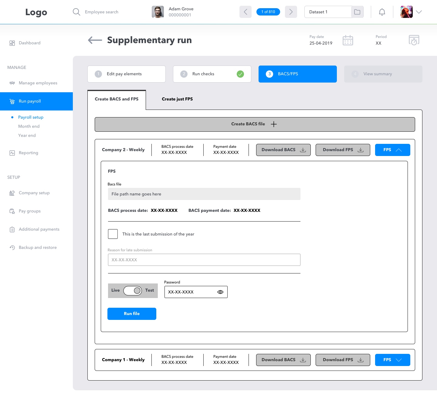
Other feedback related to the BACS and FPS process included:
• "We sometimes just need the FPS process and not the BACS and FPS."
• "Do we always have to produce a BACS file, even though we do that externally?"
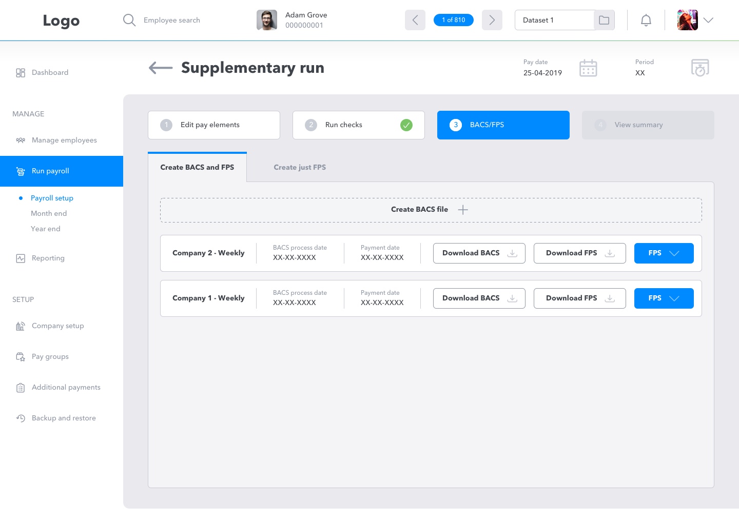
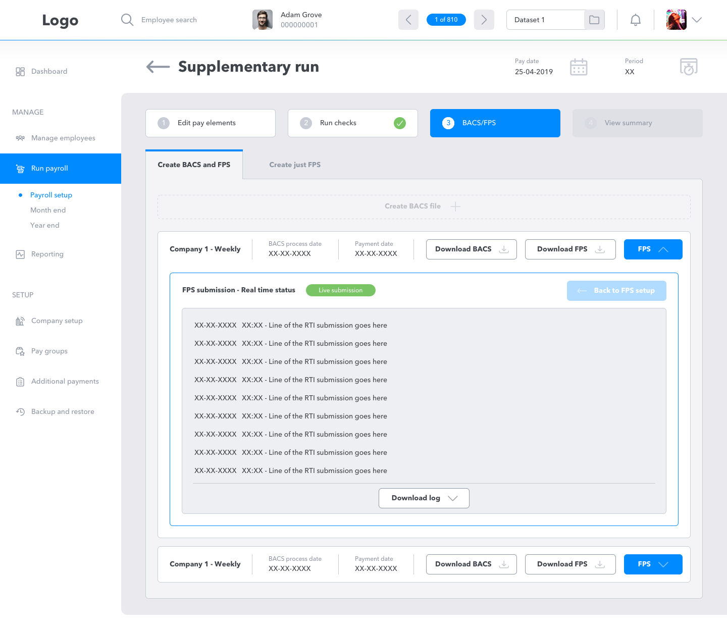
I realised that we needed to ensure that users had the options to both create BACS file with and FPS against it, as-well as JUST an FPS for users who need to submit an FPS submission when following a BACS process externally, this is a process which can occur with smaller businesses or as a one off.
What I've Learnt
Payroll users don't always find the classic UX patterns useful, they are extremely detail orientated, follow strict processes and don't want any fuss (unnecessary coloured backgrounds) when it comes to getting employee's pay completed correctly and on time. Everything must be functional and there for a reason, no fancy stuff and no fuss. Otherwise users will assume it is and waste time and this could also cause confusion.
User assumptions are sometimes wrong, users will sometimes have unforeseen processes and you need to be able to provide solid and trusted solutions for these. This highlights the importantce of user testing, especially with mission critical software, as early as possible in the process.
The Final Designs