Pharama
Wholesaling app
Project role: UX/UI Lead
Project time: 2 months
Please note: Some sections of these designs have been removed for legal reasons.
The Challenge
Clients need to complete the FMD (Falsified Medicines Directive) process correctly in a fast paced pharmacy environment where single packs and small batches need to be processed.
Final Outcome
A quick and easy to use system that allows pharmacies and smaller wholesale companies to process packs of medication quickly. Users can easily choose their market and then process packs as they need to.
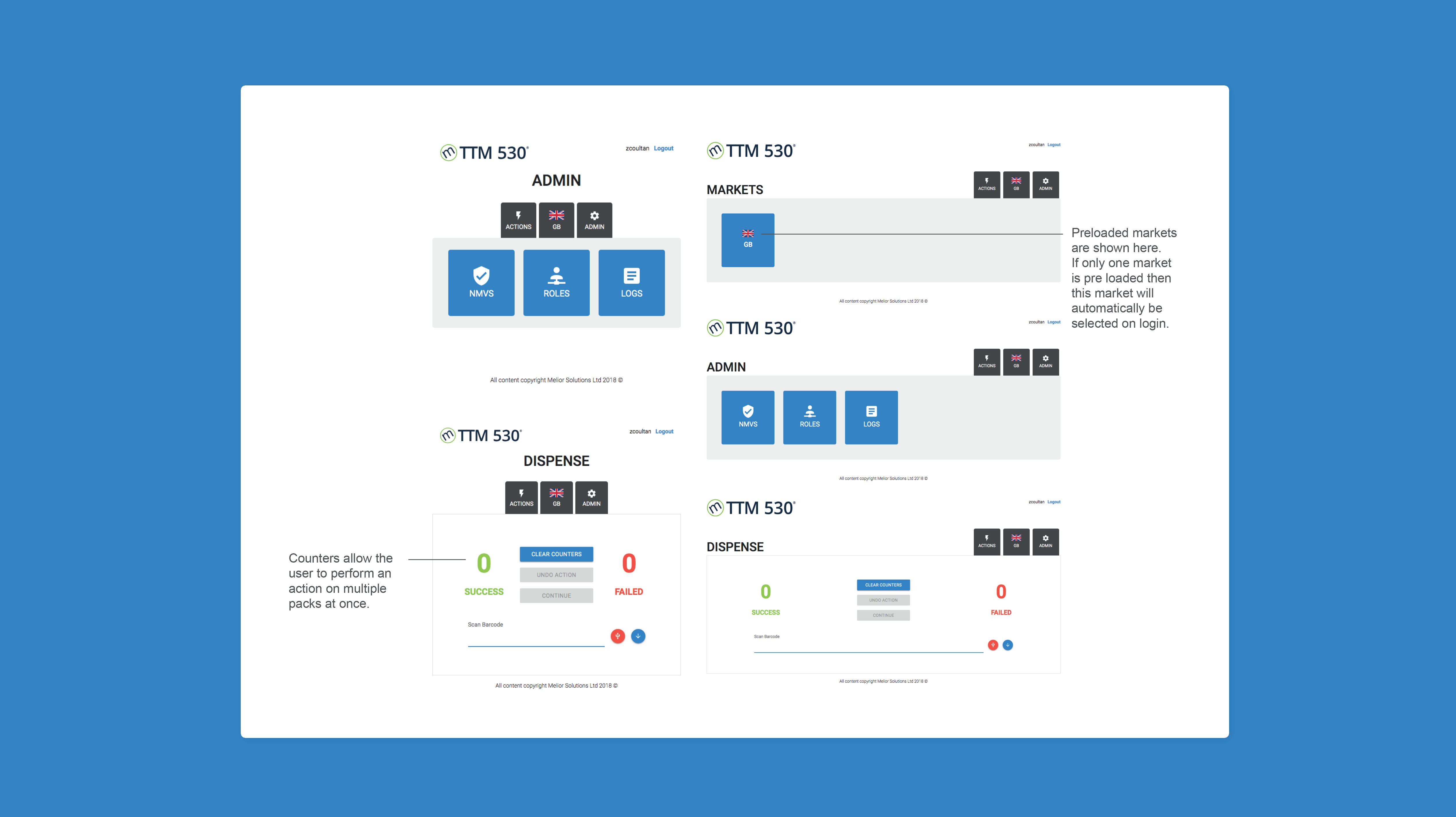
This process also allows for processing packs rather than batches, quickly and all processes ensure that the user abides by any MHRA recommended and legally binding requirements.
The Research
Understanding Legislation and Leveraging Support
I familiarised myself with the European legislation from the FMD (falsified medicines directive).
User Observations
User observations were carried out at pharmacies to help us understand the environment and processes that pharmacists take.
Sample of Research Findings
• The users want to verify more than any other action.They need to check securely that they are giving the right drugs to the right people.
• Wholesalers need to be aware of which market they are in, in a quick and easy way. They need to be aware of this at all times.
• Users need to be able to use the product on a tablet, more than any other screen size.
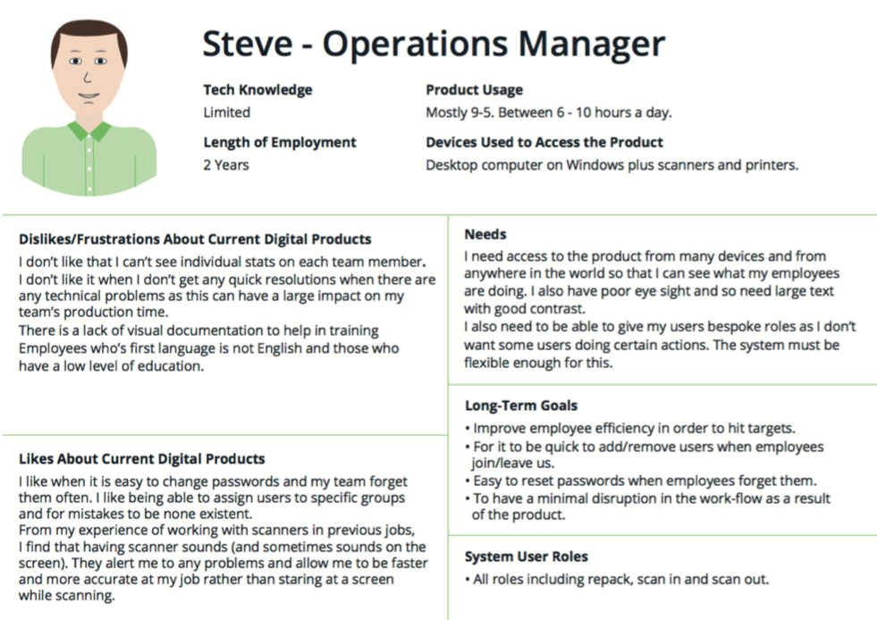
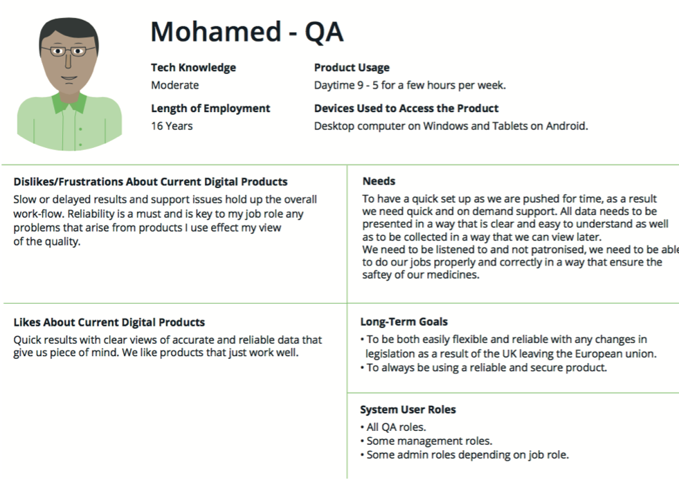
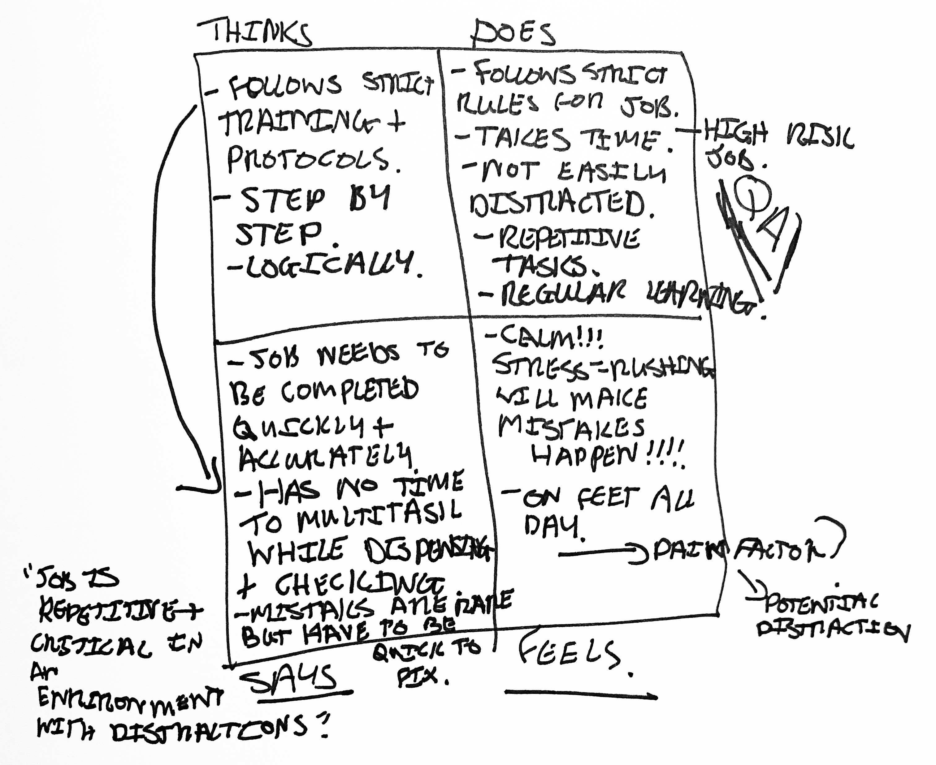
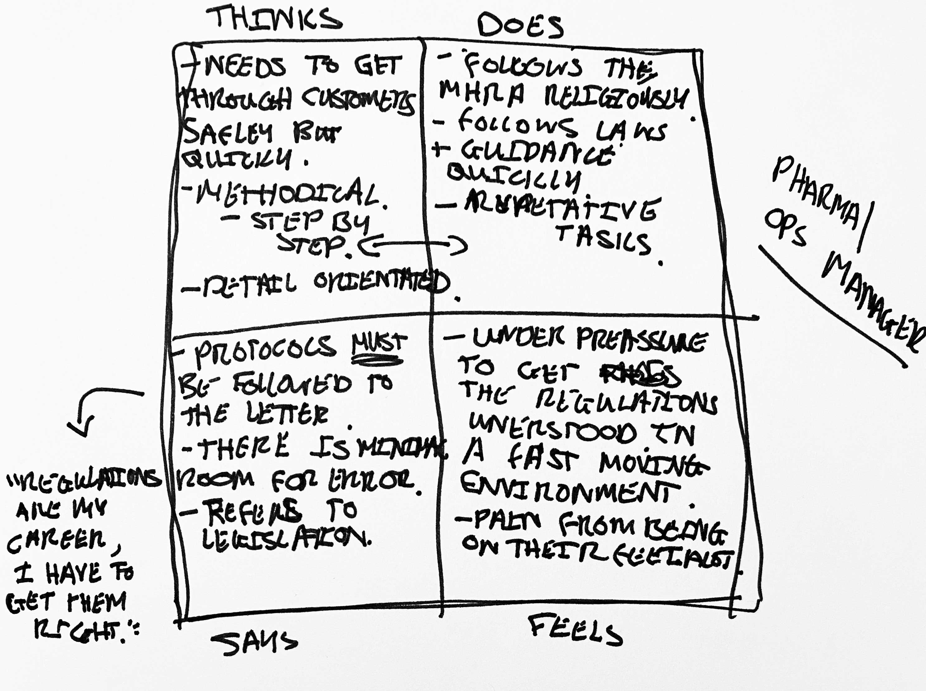
Pharma Manager and QA Persona
Empathy Mapping
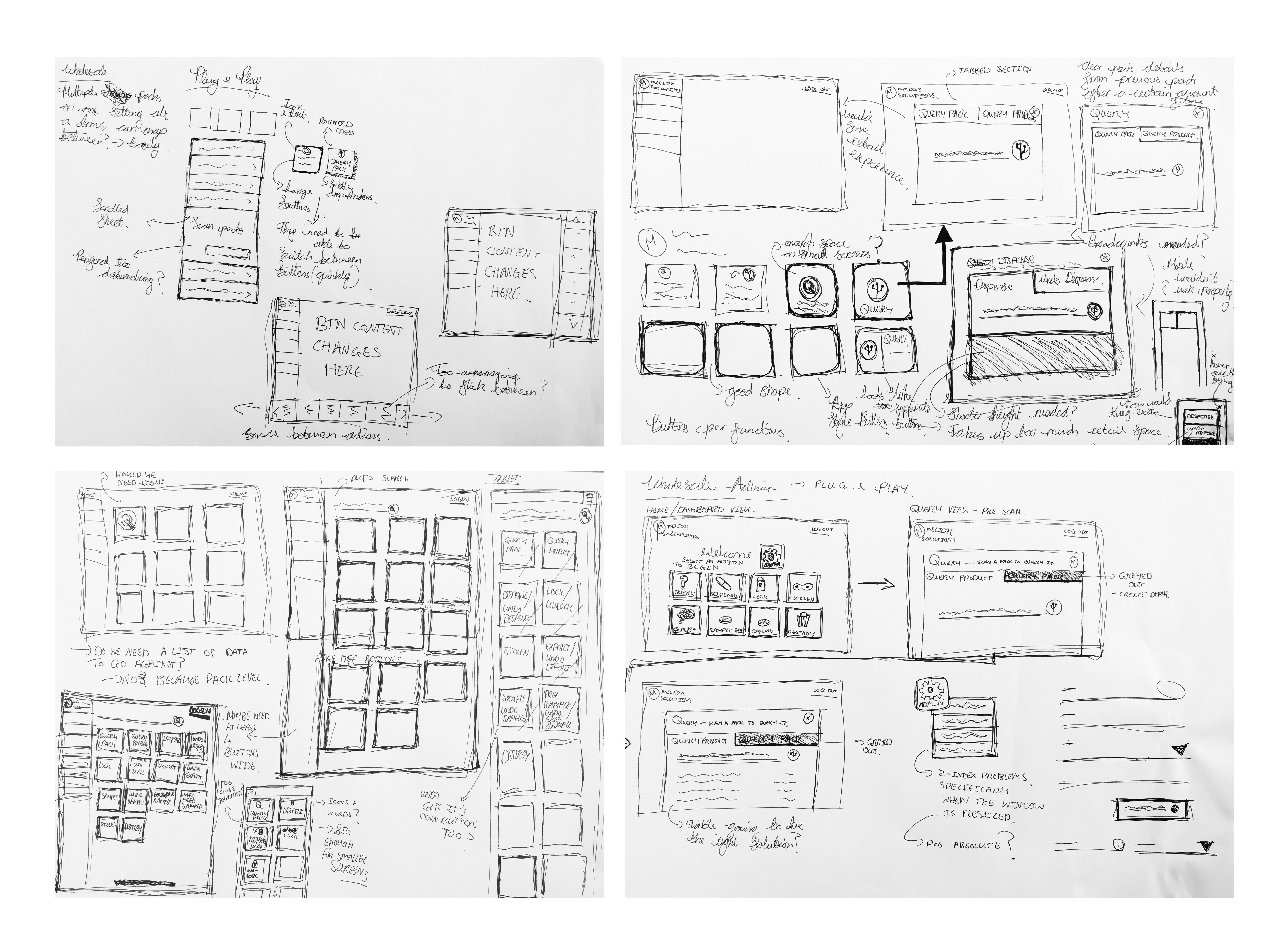
Functionality and Layout
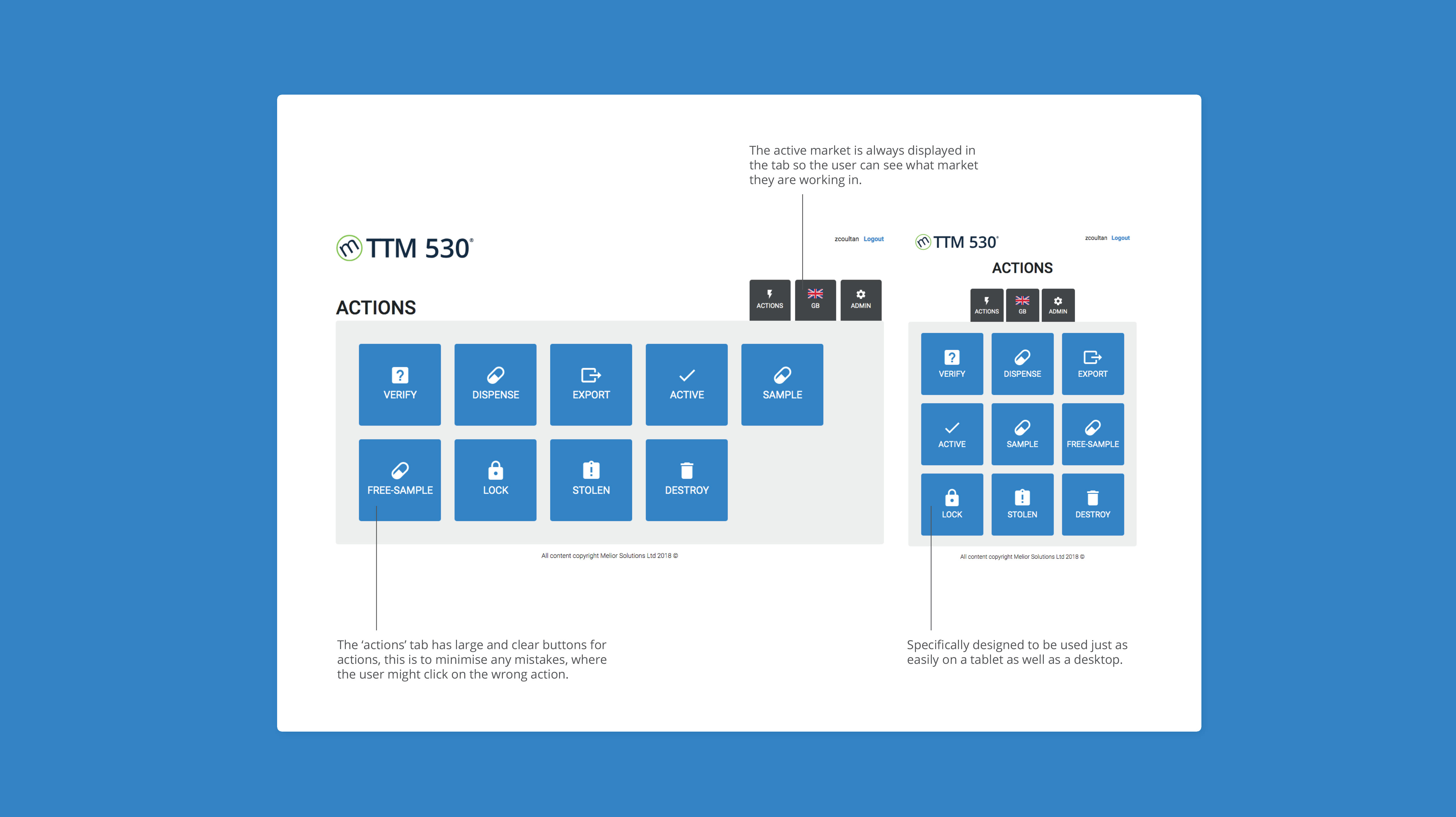
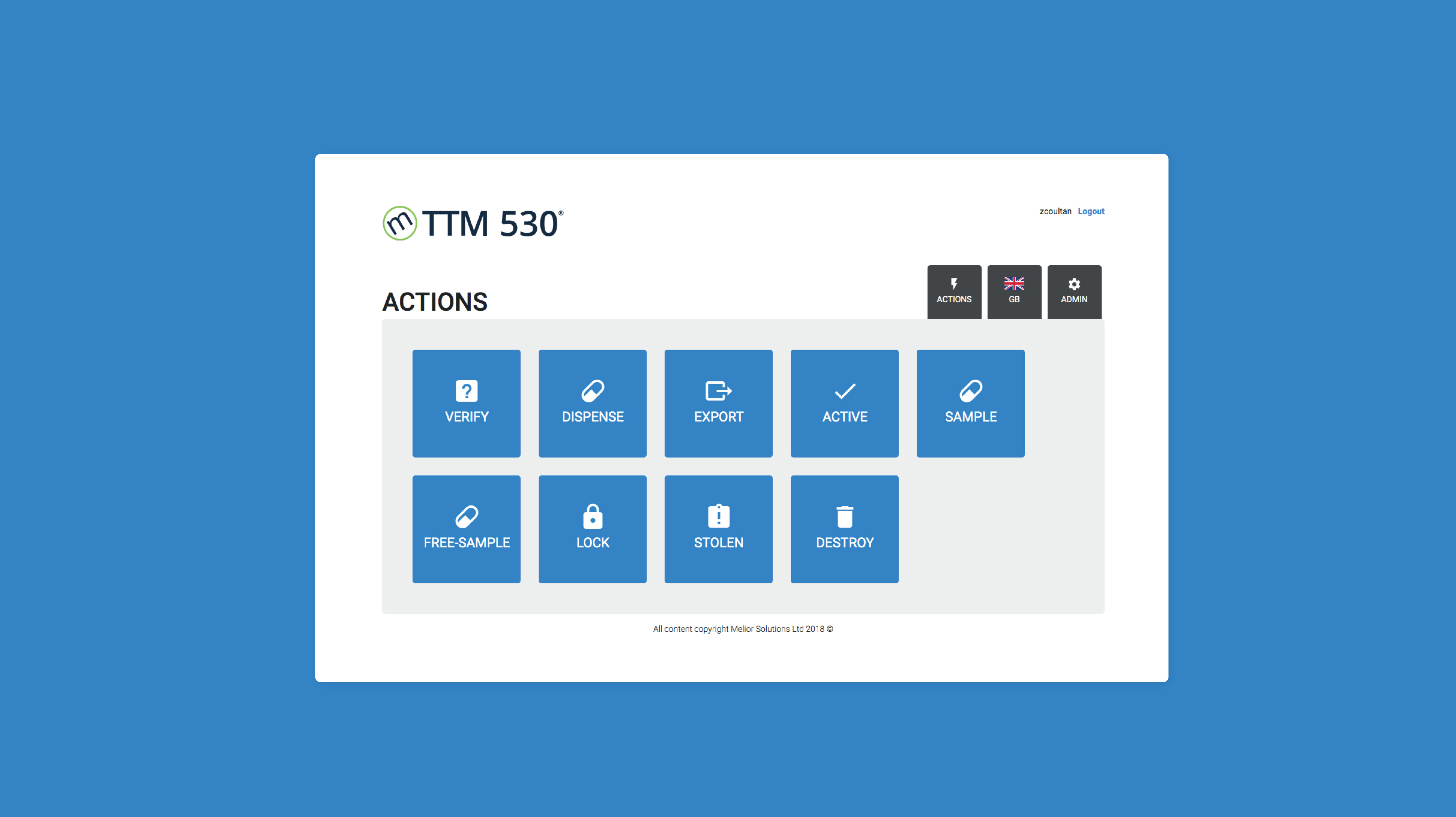
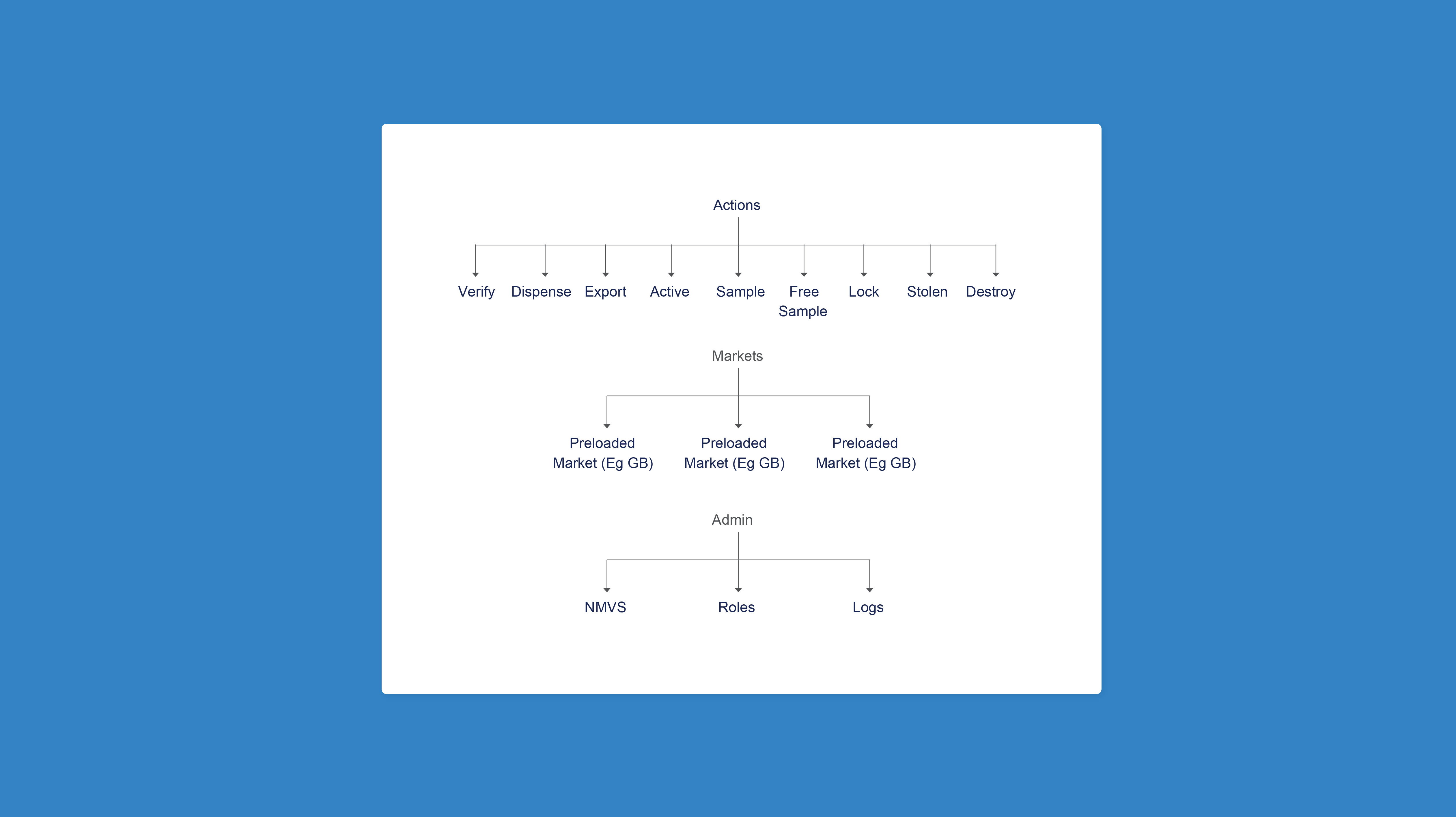
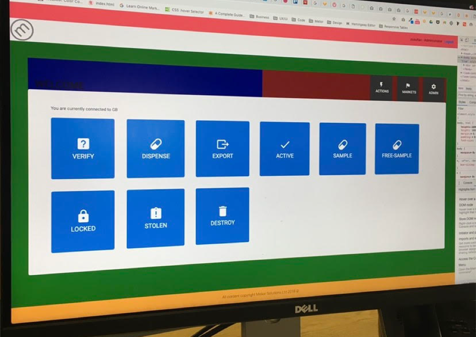
In order to make the product quick to use, I decided to make all of the actions easily available to the user on one page, I felt that larger buttons would work well to avoid any mistakes.
When the user chooses their market, it will be visible in the markets tab at all times. This provides a quick confirmation to the user that they are in the right market.
Testing
I started by figuring out the best button sizes or accuracy in a high pressure environment. We found that our tests aligned with the Nielson Norman Group’s reports of a minimum target width of 2cm - 2.5cm. This was tested by recreating a similar environment for users to ‘mock’ work in.
I then moved onto figuring out the best order for the buttons. I spoke to users about what functions they would use the most. The top two results that came back were ‘Verify’ and then ‘Dispense’. While muscle memory will provide you with the speed, keeping the most used actions at the top of the page and grouped together will reduce the time it takes to navigate between the various actions.
What I Learnt
Highlights
• Minimal room for error.
• Errors need to be quickly undone.
• Speed and precision.
• Bad accessibility will cause more mistakes.
Users within the pharmaceutical industry work to (as you would expect) very tight regulations and so therefore there is no room for error when creating a process that will be used in a busy and fast passed environment.
As a result of this, rigorous testing involving, muscle memory, reaction times, and speed to undo mistakes in the unlikely event that they happen is not only needed, but absolutely critical to the success of the product.
Accessible Products Reduce Mistakes
In order to help reduce friction with the products, I designed the software using the Material Design System. With users having to take many years training to become a pharmacist, QA and QP. These users will commonly be of an older age, as your eyesight starts to deteriorate (according to
https://www.nngroup.com/articles/usability-for-senior-citizens) by Nielson Norman is is vital we ensure that all users can use the product with ease. This includes accurate and consistent alt tags providing the use of screen readers, tabbing, voice to text, small chunks of text to allow for people in pain from standing/sitting for long periods of time, as well as the standard colour contrast compliance for assistance with both temporary/permanent illnesses.
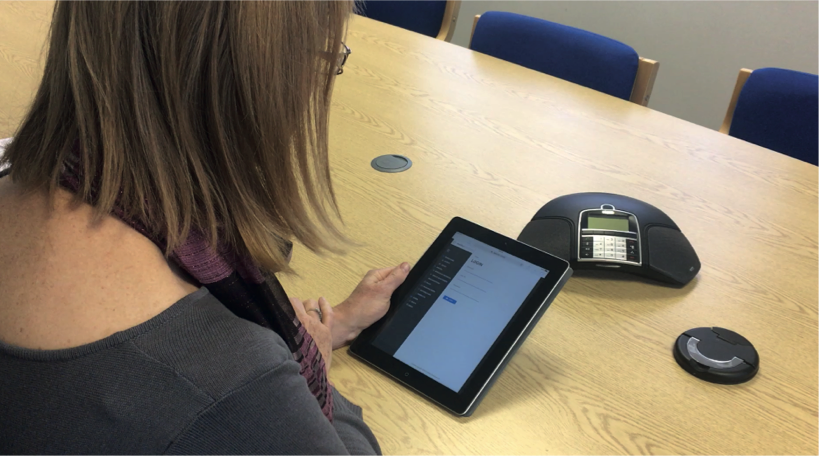
Working With Developers
Here you can see myself working with the developers in order to easily define the layout. We used coloured blocks here to easily define what parts of the product may need tweaking.
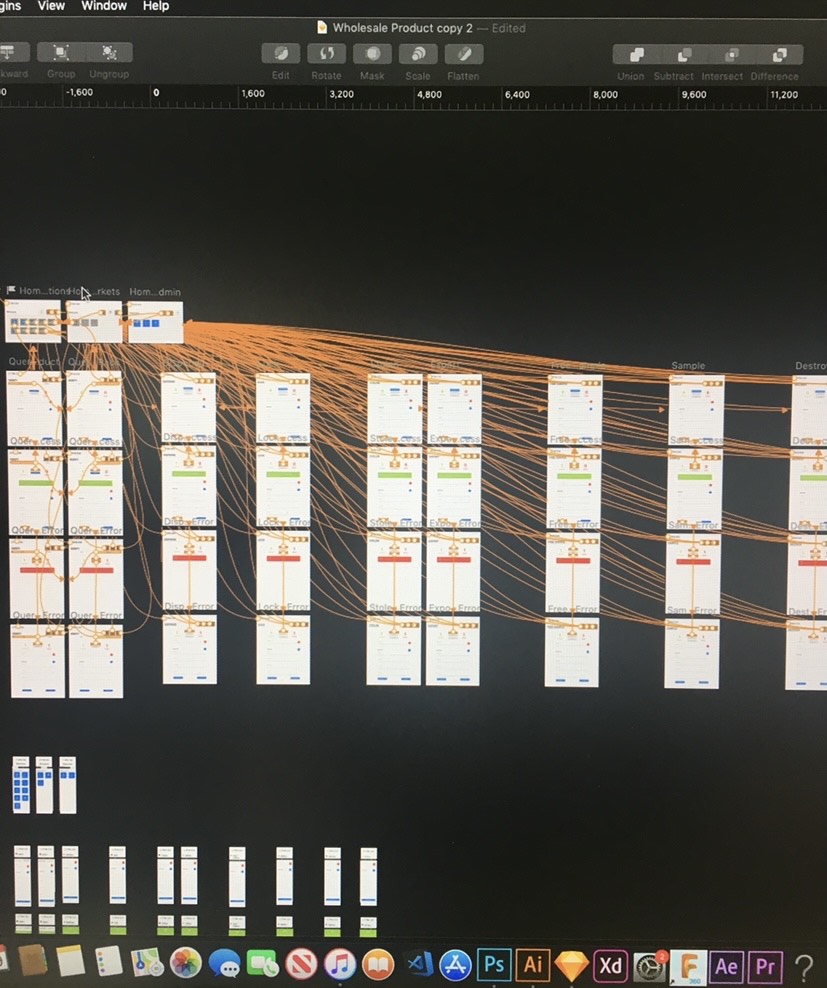
I prefer to work side by side with developers throughout the whole process to allow time for any technical restraints, further share knowledge and help to create seem-less handovers. As a result this develops great collaboration, overall better product results and more deadlines and targets reached!
Final outcome
Below are the suggested wireframes that were created a a result of my research findings, ensuring to include all key takeaways and accessible features.